Colour Trends: Looking back and looking forward

There's nothing like the end of a year to make you hop around in your thinking.  While I'm busy considering the colour trends for 2015, I'm  also looking back to see connections and possible threads that can make these new colours have a little more staying power.

I'm interested in creating fresh looks through creative use of what is in a home, energized  with a few new purchases.  To pull this off you need a long term view of what is happening in the world of colour.  

Last year dark blues were prominent in  many of the images you saw in magazines and online, first appearing in Pantone's fall 2013 predictions.  That is still a strong look and one that  will  hang around for awhile.

If you look at Pantone's spring  2015 predictions you will see several tints/shades of blue.

Pantone colours spring 2015
source

My favourite is 4 Classic Blue because it is crisp and deep without being too cold.  Check out  this combination of dark blue with natural colours.

Designing Home; colour trends 2015, modern country

There is also a fresh take on the "old" country look emerging with clean lines, less clutter, natural materials and prominent textures mixed with lighter woods.   Think pared down Pottery Barn.  I've packed a number of possibilities into this style board, but you wouldn't want to use them all in one space.

colour trends 2015, olive green, Scandinavian , Designing Home style board

My personal preference  is more a mix of West Elm meets the Scandinavian countries. Notice the olive green which will be big in 2015.


Designing Home, Margaret Ryall, style board, colour predictions 2015, olive green
This colour would work just as well as the dark blue in the Modern Country look.   And it is so sharp with black and cream.


Pantone's 2014 colour of the year Radiant Orchid came in like a lion, and obviously went out like a lamb because apart from what I saw online, it did not impact my life or design practice in any way.

 I actually liked this colour where many designers didn't.  I've always loved those redish purple hues especially in textiles, but not so much in furniture.  If you bought into this trend, it is easily updated and made even more interesting when combined with yellowish greens.   Just check out the pillow lower left  for an indication of this blend as well as the rug and artworks.

And now for 2015 Pantone is staying in the same arena with its choice of marsala, but definitely browning it down quite a bit to create a heavy bodied colour.  Again not a favourite of many designers.

Pantone 2015, marsala, Designing Home, Margaret Ryall, style board
 I've seen combinations of it with a variety of blues even cool ones and they all look fantastic. It also looks great with the oddest combinations as you can see below. I'm particularly loving it with blues and light creams.

Pantone 2015, marsala, Designing Home, Margaret Ryall, style board

Who knew it would work so well with orange and coral? 

Since I only spec Benjamin Moore paint colours in my business, I am always interested in their colour trends. 


Benjamin Moore's  2014 Breath of Fresh Air at least supported the spa/beach vibe that is still a go- to look with many homeowners.  It is a versatile colour that looks great with pearly grays, driftwood colours and soft or chrisp whites.  It also combines well with marsala and the current  Benjamin Moore colour for 2015, Guilford green.


 How can you possibly go wrong when you have two obvious "earth" colours like blue and green.  Nature never makes mistakes!


When you consider the metallics in your home, the move to warm metals is even more pronounced this year.


Brittany Makes Blog 

source 

 In  European markets  copper and pink gold are hot commodities. They are not as versatile for all over use especially the pink gold which always comes across as very delicate/feminine.  

source 

 In North American decor golds and  brass are prevalent. I'm fond of a more burnished look with these metals.  I can't seem to bring myself around to the shine of yellow brass - too much history. The yellow metallics look great with greens, dark blues and brownish reds like marsala.  And mixing metals is still very trendy.  Go for it.

Lots of connections.  Do you ever consider colour trends when you decorate?


Decking the Halls with Between You And Me Signs

The holiday season is in full swing and I can feel that buzz of energy starting to fill the house. Its only a tiny humming right now but in the next couple weeks it will turn in to full blown jingle bells!!
I can't help but deck the halls because well, its my most favorite part of the holidays. 
That and watching the excitement grow in my little ones as the days become fewer and fewer until the big man arrives!
This year I want to keep things simple. I want the house to have the warmth of the holidays but not lose itself in all of those decorations! Thats why we have decided to scale back on the three trees we usually put up and the word "simplify" is what I keep repeating in my head. I want the girls to grow up in a home where we celebrate the season by being together as a family, welcoming in friends, eating, drinking and being truly grateful for the gifts we receive every single day. It is so easy to get caught up in it all....the wants are poison for the soul and this time of year can be especially challenging.

That is why when I saw this sign from Between You and Me I knew it was perfect for our home. 
Love grows best in little houses. Oh this is so true for us. I speak from real experience here. If you are new here and you don't know my story, well then you should know that this is our seventh home. We have had our fair share of houses and all different. Some were much bigger then our home is now and some were smaller. But our happiness has never changed with the size of our home. I want my kids to always be close to me. I want to hear their laughter from the other room and yes, I even want to hear the arguing...it helps me, help them, solve the issue a little faster...not always but most of the time. I like living in a home where I don't need a monitor to hear if my baby needs me. Now, please believe me when I say that I by no means think my house is tiny! We are quite blessed with our home but again its no mcmansion either...its just simply perfect for us.
Its the perfect message for our family and exactly how I want us to be...so close we can't help but talk to each other. So close we don't miss a thing. My babies are growing faster than I would really like to believe so keeping them close to me is more important to me than anything else!
If you haven't heard of Between You and Me Signs, first I can't even believe that, but you must visit their shop. They are making some truly beautiful pieces! I have a running wish list in their shop and I'm hoping that one day I have a house full of their amazing work!
Another piece of their work is hanging in our family room. It is a custom piece and the lyrics to one of my favorite Mumford and Sons song Below My Feet.
It's one of those songs that you listen to and it moves you. It speaks about what so much of us experience during our early years. Being young, not worrying about the future, not needing anything but yourself to rely on and then one day you wake up and you can't handle it all by yourself, you never could. You realize that you need more, you need Jesus. This song speaks to me because I too needed my savior. I needed to know that God really loved me! What I didn't know was that he had been with me all along, I just needed to come to him. When I did, I was greeted with open arms and he wrapped them around me and has never let go. It always makes me a little teary eyed when I hear it because I'm so thankful to know Gods grace. Now I have those lyrics hanging on my wall to remind me of this everyday.
I'm so happy to have found their shop! I have these two amazing signs in my home, both of them bringing so much joy and reminding us of the things that we hold dear as a family. 
I'm getting ready to order another sign for a friends house warming gift and now is a perfect time for you to do some shopping of your own because Between You and Me Signs is offering all my readers a 15% off discount today through December 31st!
Just use promo code HOUSESEVEN15 
Enjoy!
 XOXO


Christmas staples: Buds, twigs, branches and berries

There's nothing like the real thing for Christmas decorating.  You get to go for a little adventure in the woods with your trusty snippers, and come away with a red nose and a trunk full of inspiration.

Sometimes you just have to go to your backyard, but there's a limit to happy cutting in a small space. That's where I got the materials for my front porch planters, if you don't count the leftovers from my summer planter and feathers I've recycled several times.   

Christmas planter, red dogwood, pine,


 Hubby made me a trough box for my trunk/ottoman.  I knew what I wanted to put in it, but I couldn't hack away anything else in my yard. My sister came to the rescue.  Remember last year when I posted about her nature inspire Christmas?  She  had already made her yearly trip for bough and twig cutting to complete her planters and agreed to take me to her spot. Bonanza.

Here's her efforts ...


Christmas planter, red flowers


twig vase, red flowers, yellow flowers, Christmas


Don't you love that hit of yellow with the red?


Now on to my family affair project..

gold, silver spray painted box

My son sprayed the box for me with  Krylon Colormaster  in nickel.  Then I taped it off and used gold to create two stripes around the box.  I figured I may as well get with the mixed metal trend.


alder twigs, fir, candles, trough box,LED candles

  I had three LED candles (so safe and they actually flicker- daughter tip from Costco) I wanted to use and went to the dollar store and bought seven square glasses  to put oasis in to keep the boughs fresh. The alder twigs looked a little boring so they got the spray treatment too in a mix of nickel and gold.
Then I began the arrangement.


trough box, candles, greenery, twig balls


Fresh flowers are a must anytime of year.


A favourite vase, fluted and textured makes a stunning centerpiece on my coffee table. Nothing else is needed.


red berry wreath,  white carnations

And my favourite berry wreath that has been in every room in the house over the years surrounds a vase of baby's breath and white carnations.  You can tell I like my flowers simple and usually white because they work anywhere with anything, especially with red.


I was very lazy with the  dining room  additions....


dining table vignette, white reindeer, LED candles, Norfolk pine, cranberries

I'm not a theme driven decorator, but  nature is always a staple in whatever I do.  My new purchase for 2014 was two white carved reindeer.  I always buy a green plant;  this year it is a Norfolk pine in a faux burlap container.  May it live for awhile.

For my dining table  centrepiece I simply added some fresh cranberries to my Boblen vase, and used it as a candle holder, added a string of red wooden beads  (at least 30 years old) and fake red berries  to the well used  vase of twigs.  In honour of the season I changed my tray to my favourite white one with the silver leaf birds and leaves.

And wise silver bird  looks on knowingly because he's seen it all before.

Garland Table Setting

We kicked off the holiday season this year with a house full for Thanksgiving and it was simply awesome!  We had family from near and far with old friends and new ones all gathered around our table. We spent the day as a family lounging around, first watching the parade, cooking and finally welcoming in our guests as they arrived. What a better way to celebrate the spirit of Thanksgiving and help us kick off the holiday season. It was a pretty perfect day!
Anytime I know we are going to have a house full of guests, the wheels in my head start turning and all I could think was what kind of table setting we would have for our guests.
I knew I was going to have a giant table to set and I wanted to keep everything simple yet festive!
So I went with a 13 foot garland made from fresh eucalyptus, sage and evergreen.
Oh it spelled so good!!

Our place setting was a mix of old and new. White linen napkins, antique plates, new white porcelain plates and of course our little feather bunches. I also added a little rolled up piece of craft paper for our guests to write what they were all thankful for this year. This is a little tradition we do in our home where we all write down what we are thankful for, drop it in a pitcher and then during dessert we pass the pitcher around the table and each person takes one out and reads it. Its so fun!!
I really was so happy with how the painted flatware turned out! I also
have to update you and let you know that purely by mistake it all went through the dishwasher! OOPS! But guess what...it totally survived! No chipping or scratching! So if you are considering this as your next project, I recommend it as a good one!
I hope you all had a wonderful Thanksgiving with friends and family and now we are on to Christmas to do it all over again! Whew this is a busy time of year....it must be, even this little post is a tad late:(
Here is to an amazing holiday season and I can't wait to share a few updates to our home in the days to come....
oh and you're getting a sneak peek right now!!!


10 reasons to love Olive Green for 2015


Many shades of olive green 

You may have lived through the avocado phase many years ago, but don't nix olive green automatically because of that.  I am talking about a new updated olive green look.  One that can be both traditional or contemporary.  One that takes on many faces depending on its pairing.  Just think about it this way. It....


  1. is more of a neutral, so the combinations you can come up with are almost limitless;
  2. can easily push a hint of it into any decor you already have;
  3. sits there and lets you manipulate it;
  4. references nature, how can it be a bad thing? (mossy rocks, under side of a leaf);
  5. mixes with all the warm metals that are now in vogue; 
  6. is warm and organic and will make a space look that way;
  7. can be mixed with fresh or muddy colours;
  8. works well with Pantone's 2014 colour of the year - marsala;
  9. won't be a one hit wonder because of its special qualities listed above;
  10. just because.


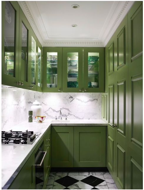
How much of it you want to add to your decor is up to you.  Personally I won't be going out and getting a new green kitchen, but it could be pretty spectacular.... 


I love olive green with white and black as you can see from my style board.  This green is more vibrant, approaching apple green. Some people refer to it as olive green, but it needs to be "dirtier" to fit my definition of olive green. 


Yes!  My two favourites with olive green - black and white.  So fresh.   What happens when you start to muddy up olive?  Check out below.  Still an interesting look. 


Spicing it up with pattern always helps.  A range of greens that have been popular over the last several years are mixed with the olive. in the chairs and pillow .  Note the connection of the brownish green wall with the scheme in the next photo.


 This is a very different olive green that is approaching greenish brown. If you've mixed paint you know how easily that can happen.   It certainly helps  you see how the colours relate when they are separated out . 


This room is built around variations on the lightest colour in the photo above.
Now we're talking my idea of a serene olive green.  Everything in this space is understated with just the the merest hint of olive. Love the textures.


Perhaps olive is the answer to my ongoing love hate relationship with the accent colour in my living room.  I'm not living well with my rusty red. It has never sat well in the space. Something to think about.

Stay tuned for other pairings for this interesting colour.  Do you think olive green will feature in any way in your home in 2015?


Design trend 2015: Move over Ikat and Suzani


It's that time of year again. People are beginning to think about 2015 and what it will bring. When you're a home decor blogger that always means checking out the hot new trends.

So here goes- my first trend snippet for 2015.

Sometimes even patterns we love can lose favour if they are overused.  Chevron comes to mind.  What was once a fantastic pattern that played well with other patterns because of simple, graphic lines has been overused to the point of -dare I say it- nausea.

Ikat                                     Suzani 


I fear that Ikat (chevron is a staple of this traditional Indonesian design) and  Persian Suzani (with it's bold circular motifs ) are not far behind in the over used category.


 There is chatter that Shibori (Japanese tie dyeing) is the next new pattern to take over in textiles. I can see the appeal of Shibori.  It is geometric (very hot right now), simple on a white background, has multiple patterns possibilities  depending on how it is produced, and has cultural references.  Then there's that indigo blue which feeds into the resurgence of blues and navy in colour trends.

You many not be familiar with this age old Japanese technique. Shibori patterns are usually created on white silk by binding, clamping and wrapping around poles and then dipping into indigo dyes. If you are hankering for the 60's again, or don't remember them and are ready for a new DIY experince, check out this article 


Red was all over High Point Market this fall and just seeing the little hit of red in the lamp tells you traditional indigo shibori would look great with any amount of red. Certainly whites and other blues would also work and why not yellow?

It is definitely a keeper when it comes to pillows.


shibori pillows

This proves that it is possible to have subtle colour ranges using contemporary dyes


shibori pillows

shibori colours
source 

and different colours...


shibori chair

shibori sofa

used in  different ways .

shibori bedding , shibori curtains

I am certainly liking it with very neutral schemes because it is fresh and interesting without too much fuss. 

Only time will tell if shibori will bethe next big thing. Do you think this pattern will have a place in your home?
 

Copyright © 2014 | Design By: Home Inspirations