Turkish Rugs and my Entryway


I have struggled for some time now with what exactly to do with my entry way. 
It opens directly in to my dining room and even though I love how open the space is as times, I have toyed with the idea of actually having french doors put in to define the space. 
This is something that perhaps I might end up doing some where down the road but for now I will certainly work with what I have. 
But, it needs something. You know....something to say, 
Welcome- there is a pretty awesome family who lives here and we want you to stay awhile and enjoy your time here. 
Well, whats happening now isn't saying any of those things! 
If you follow my blog at all you will know that color is not something I gravitate towards. I'm a neutrals kind of girl but one entryway trend that has me on my toes is the Turkish rug,
 or Persian, or Oriental, or whatever you might be calling them.....I kind of love them!
Although these rugs are far from new, I feel like I'm a couple years late on this trend for sure... I'm just really starting to see them everywhere and fall in love with them. 
This could totally have to do with the fact that I'm looking for them...Ha!  
But in my search, everything that I seem to find, I just adore.
Not to mention I need a rug that can serve it's purpose and handle the responsibility of holding the title of entryway rug. Its not an easy job for a rug! This area sees more foot traffic then any other spot in the house and it has to be up to the challenge. It certainly can't be a rug that shows its emotions on its sleeve, or surface, or whatever...you get my point. 
If it allowed all the marks of every person that passed over it show then it wouldn't work here long!
 I need a rug that can take the abuse and keep "most" of the marks camouflaged to the best of its ability! I also needed a rug that appears to be more that just a gigantic door mat and maybe just maybe people won't wipe their muddy shoes on it because it happens to be in front of a door....doubt it, but a girl can dream! 

Check out these inspiration photos I came across recently while working on a client project....so good!
Cottage and Vine Blog

 Apartment Therapy
The Every Girl 

And my absolute favorite of them all....here below
Heather Bullard's entry way and the one I dream about!

Seriously people...its my all time most favorite ever!! 
Can you tell I love it yet?

I have even considered replacing my entry table with this one from world market to achieve the look but unfortunately this is not in my current budget.....blah!
 So instead I went ahead and purchased the rug!! 
Ahhhhh,
 I'm excited and a little scared at the same time because I know me and color can make me anxious.  But I had to remind myself that this is something I've been considering for quite some time...no impulse purchases here, thats for sure! 
  I have looked at so many rugs and when I saw this one, I knew it was the one. 
I think it can handle the job at hand and if it can't, well I guess I love her enough to find her a new spot in the house. 
I guess we will just have to wait until she arrives to see....I will keep you posted!


Just Blush!

 The Oscars are always a spectacle, sometimes inviting, sometimes confusing  or repellant depending on your life view.   I have my issues with them, but that's not what this post is about.

In addition to rooting for my favourite actors and movies, Oscar night is a great opportunity to see how fashion trends (always connected to decorating trends) play out on the red carpet.  The best and worst dressed are a matter of opinion.  This is obvious when you read several sites and compare the observations with your own.

Blush pink and its variants was the stand out colour for me.  Even some of the gowns described as white had subtle pink undertones. 

Blush Pink appeared in late 2014 as a trend in fashion and decor  and is continuing into 2015 especially in the European market.  It is a delicate hue that looks especially good with soft whites and/or pearly grays.


blush pink, decor trend 2015, blush pink furniture, blush pink accessories,


This style board gives a good representation of how the trend plays out in furniture and accessories. 


 And in fashion ...

from the merest hint of blush

 Kerri Washington

 Viola Davis 

Karolina Kurkova

Jennifer Aniston 

 Oprah

Zoe Saldana 

Jennifer Lopez

to its darker depths

Gwyneth Paltrow

and more vibrant applications. 

The pinks have it.  

Could you live with a little pink in your life?


Chairs....a small obsession

Do you have something you constantly gravitate towards when styling your home?
Maybe its rugs, lamps, baskets?
For me its chairs...
I can't stop. 
I just love me some chairs and I love pairing them up with a new piece of furniture. I'm constantly switching around the chairs in my home. 
Recently I found this image
Oh and I seriously died because I  L-O-V- E all of it! Every single thing!
Well,  if you follow me on Instagram you have seen this image on my feed because I shared it with the question...."what do you think of these ghost chairs?" 
My oh my I should have known the reviews would be mixed but never did I think I would get so many that totally dislike these chairs....like the response was "yuck" by some. 
Now believe that I welcome all of this feedback...you certainly can't put something out there like that and expect all answers to agree that they are as fabulous as you might think. 
I love that there are so many differences in what is beautiful in design. It creates a world of variety and opens up our design geared minds to maybe some things we wouldn't have thought of on our own. 
Beauty is in the eye of the beholder after all!
So all the response got me thinking that maybe thats not the direction I want to go in after all. Although, I'm usually pretty confident that I know what I want in my home. I felt it wouldn't hurt  to open up my mind to other possibilities.
Here are some other ideas I've thought about for our kitchen table.
These I stole from the dining room just for a minute. I'm in love with these RH ones below and considered purchasing four of them for this table but then I wonder if they are too close to the dining chairs?
I used to have the parson chairs at the table but it didn't function well for us. Way too many dirty hands around here that see white chairs as giant napkins for those little hands!
It was so pretty but not functional.
So I switched to these...
Its funny because when I made this change everyone said "NO!! We like the others better!"
 But then they grew on everyone and when I considered the Ghost Chairs above.. again, it was "NO!!"
So I borrowed one from my friend just to see....
Well, I like it. My husband admits they are more comfortable then the metal chairs but he doesn't particularly like them. Thankfully, he doesn't care much about what I put in the house so I have free reign to do as I please. 
So after all this, what have I decided?
I guess to just leave the white metal ones for now. They do function quite well...clean up is a breeze and I guess I will do the smart thing and wait to the kitchen reno is complete before I start to style it!
So hard though!!!


5 decorating solutions for one traditional mantle


Mantles can bring out your inner decorator or cause you frustration.  I hope at the end of this post your inner decorator will be leaping.  If you don't have a mantle, but have a buffet, console table or even a wide window ledge all the principles/design tips  still apply.  for additional information about  decorating above a fireplace check here.

Come along to a traditional home that is getting a foyer facelift.

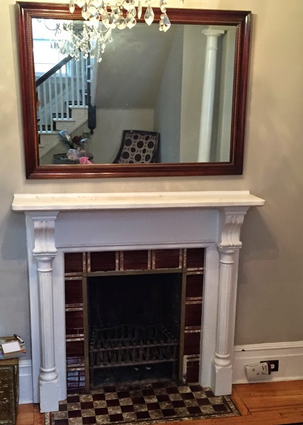
Fireplaces and mantles are usually a focal point in a space.  Often there are other architectural details that ensure it is a dominant feature.  In this case, there are two archways on either side of  the fireplace, one into  the living room and the other into the dining room.  While the fixtures in the home are traditional, the homeowners have mixed in contemporary furniture while still honouring the original feel of the house.


Original photo from homeowner
Initial observations:

The mirror:
  • reflects the chandelier adding interest 
  • has simple traditional styling  that relates well to the  the other architectural features
  • will  reflect what is put in front of it adding  visual depth
  • frame has same tones as floor only darker
  • fits the width of mantle, but seems to overpower it (less so when you are in the space)
  • is heavy and mounted on original plaster walls, it stays 

Thanks to the program Olioboard, I can import the original photo from the homeowner and layer options on top of it. That's designer's dream when presenting ideas to a client.

With the central position of  the fireplace between two archways, a symmetrical design would  be a fitting line of design. l

Solution One:

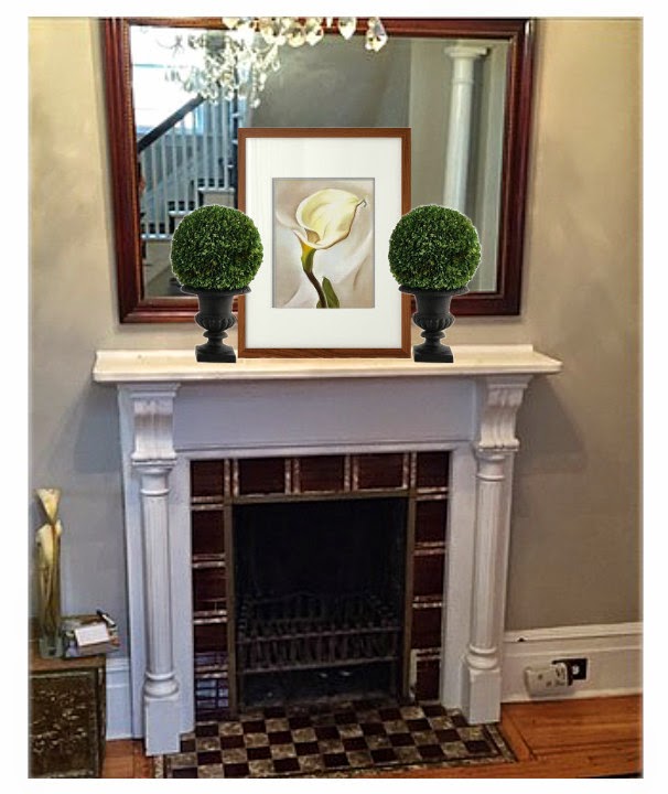
 Emphasize a vertical layout using art to bring the eye up.


Including art work with a white matt  connects with the mantle colour (try to match the white matt with mantle, yes, this one is a tad too bright). You can play with the style of art work.  Sometimes adding a modern piece is a way to combine styles. 


traditional mantle, mantle vignette, art, decorating a mantle

traditional mantle, mantle vignette, art, decorating a mantle

traditional mantle, mantle vignette, art, decorating a mantle

Thoughts:
I like the simple calla better  because  the lines are vertical and the simplicity of composition and colour scheme is calming and works better with whatever objects you choose to put beside it.  I like rounded shapes next to verticals or if not rounded, something with soft, irregular  edges.  My choice would be the vases  rather than the topiaries because I like a lighter, softer look.

traditional mantle, mantle vignette, art, decorating a mantle


Here's the same idea with a more traditional painting without any white.  The look is dark and a little overpowering and with no overlapping it looks a tad to boring.  All of this can be adjusted of course.  Which  painting works best? 


Solution Two 

Bring your eye in from the sides of the mirror by creating two strong verticals. 

traditional mantle, mantle vignette, flowers, decorating a mantle, sculpture

This is the opposite of the first solution but you are still using verticals to direct the  eye up. Having the flowers in a dark/clear frame connects with the darks in the fireplace, and also with the white in the mantle.  The vases are contemporary as is the sculptural piece but they all "play nicely together".


Solution Three 

Go neutral contemporary and layer symmetrically.

traditional mantle, mantle vignette, decorating a mantle, vases,

This arrangement still brings your eye in from the sides of the mirror and emphasizes the vertical, but it is an overall softer look.


Solution 4

Pick up the  colours in the fireplace and layer symmetrically with a mix of traditional and contemporary.

Solution 5

Use battery operated console lamps and soften  the arrangement in the centre.

traditional mantle, mantle vignette,  decorating a mantle, asymmetrical design


Just for fun...

the girls in the house would pick this one!


and I am  more comfortable with asymmetrical designs.


There are so many options  and each has its own reasoning.  In the end it all boils down to personal taste. Which would you choose if you were the homeowner? 

Re-working the egg

I couldn't resist carrying on the egg theme from my last post.    How about some of these cosy re-workings of the basic egg shape for furniture with a difference ?


Houzzz

 It's a sofa with egg shaped pillows!  Definitely for the younger crowd.


Do I ever have a spot for this bed!  It could get a little cool though on the edge of the Atlantic in May. I think a room with one glass wall would be a better bet.  New room addition to the summer house maybe?


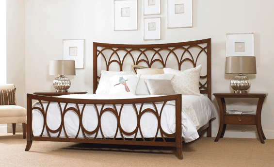
You don't have to stretch the imagination much for this bed design. The egg shape  in open cutwork is very pleasing as are the curved legs of the tables.


This is about as functional as you can get for patio furniture and the lines will fit in with any landscape .


 If you want a statement piece for you space, look no further.   How could you not like this colourful sofa?  Might have to move a few pillows to the floor.


Barbara Barry's egg coffee table is a classic. 


As is this beautiful black tub perched on the edge of a slab of marble.  

If you chose one for you home which would it be?

From snow to eggs

 We are hunkered down for a winter storm with 40 cm. of snow predicted.  Everything is closed so there are no schedules to keep. It's the kind of day where I have lots of time to let my mind wander where it may.  That's a dangerous thing when you can go from one thought to a hundred in a minute.  So let's see how I got from snow to this post.

White, cold, wishing for spring,  Easter, eggs, decorating eggs, symbolism of eggs, egg imagery through history, eggs in art, design trend for 2015 (read it on Houzz this week),  Las Vegas Market trends Winter 2015, should write a new blog post because I have time today, anyone else predicting eggs are hot, search Pinterest.  Yep!  That's how my head works.


What is a trend?


Decor trends  are predictions based on patterns recognized from multiple viewings of similar material.  Anyone can make trend predictions if they have enough information and time to look for patterns.


 Here are some of the patterns I'm seeing on Olioboard, Pinterest and design blogs that indicate that eggs and egg shapes or oval shapes are appearing in textiles, lighting and home accents.


Sometimes  eggs are represented literally and recognizable as what they are.  You will often see nests accompanying the eggs as in the pillow and art works above.  Sometimes the egg shapes are abstracted and used in repetition to create patterns.  These are the ones I find most pleasing.  

egg motifs, eggs decor trend 2015, egg shapes, egg patterns in textiles

Is it just me or do you find anything egg shaped or hinting of it pleasing/soothing to the eye? This characteristic makes it a perfect shape to choose when you want a lighting fixture to just sit there and hold a place without being  too dominant in the decor.  Sometimes this is not what you want!  For excitement do not choose  of the lights above (except the red one).


Jeff Koons, Cracked Egg- Blue

Egg shapes have always been a favourite of artists through the centuries.  Not only is it a pleasing shape, but the symbolism of promise of things to come, fertility, and creation  makes eggs a multifaceted starting point for many artistic explorations.

Paul Lichetenhan - Nest 
This work created by Paul Lichtenhan couldn't be more different than Koon's  reflective, slick and very large cracked egg above.  In this piece the aged patina of the recycled metals stand in striking contrast to the delicate ceramic eggs. 


Andy Goldsworthy 
 Goldsworthy, an environmental artist, makes a different statement with his large, stone egg defying our usual interpretation of this delicate, fragile shape. 

Ron Layport
Finally Ron Layport creates  intricate, egg shaped carvings from wood.  In all of the presented  works the material used to create them is as important as the subject matter.  Each has its own beauty. 

Eggs, simple or complicated, realistic or abstracted, may appear in some form in your decor this year. Perhaps you are ahead of the game!  Have you noticed egg motifs in your online viewing or shopping experiences?

What every neutral colour scheme needs


I love serendipitous events that add to my thoughts on an interior decorating topic.  I recently experienced this  as I was preparing to write about neutral colour schemes.  Just like a gift  La Dolce Vita, one of my favourite blogs, appeared  in my inbox with the perfect visuals to support  several of the points I wanted to make.  Paloma always finds the best spaces to present to readers! Check out her blog, you won't be sorry.

 Making a neutral scheme work requires skill.  Once you  remove colour from the equation you have to make the most of the  other elements of design especially: pattern, texture, value/contrast and form.  Of course the principles of design remain in tact. Every successful space  has  good balance, harmony, emphasis, scale/proportion and rhythm.

Sounds great, but what does that look like in a space?

Check out all takes of this  living room  by Bill Ingram & William McLure of Bill Ingram Architect.

 Quiz time:  Jot down what  you think makes  the space  work.  If you are used to colour being your main decor element you might need to shift gears for a moment to see the beauty in neutral schemes.


living room,  neutral scheme, pattern, texture, contrast


living room, neutral scheme


living room, neutral scheme


living room, neutral scheme

Contrast

The first element that jumps out at me is contrast.  You cannot have a successful room without good contrast, even when you have lots of colour.   It's the same way in art.   I wrote about this  topic in depth here.  You get contrast by manipulating your values from light to dark.  This space goes from black to white and has every conceivable value in between.

Texture

This space also gets an A+ for texture.  Not everyone can have the stone work evident in this space but you might have a stone  or brick fireplace   Check out the wood stacked in the open hearth, the tree stump table and the rough wood planters.   A variety of textiles are used from the subtly textured obviously wool carpet to the white smooth fabric on the drapery and chair.  The knit pillows are perfect by the stone,  nothing like the garter stitch for obvious texture. But the coffee table is the show stopper with its reflective high gloss.  Don't miss the folded fur throw on the chair.   There is also subtle texture on the frame of the gold chair, the doors of the armoire and the statue.

Pattern

Geometric motifs predominate with diamonds, stripes  and circles repeated around the room.

Form

This can be a hard one if you like everything matched in furniture style.  I think use of a variety of forms make this space.

My own element that every space needs -- organic elements 

Imagine this space without the two fig trees.  I rest my case.  You need organic references in every space and this one has it in spades.

Only one thing

If I could change one thing about this space it would be the scale of the artwork between the windows.  Love the art work, but it needs a little breathing space around the edges.  Too much competition with the grids in the window. Sorry, it's the artist in me.  On the other hand I love the large scale fig trees and they might account for the scale of the art!

True, this space might not be your cup of tea, but it is interesting; it invites the eye to move around and to touch the various elements in the space.

Now it's your turn...
What are your thoughts on this space?  Could you live here?
 

Copyright © 2014 | Design By: Home Inspirations